


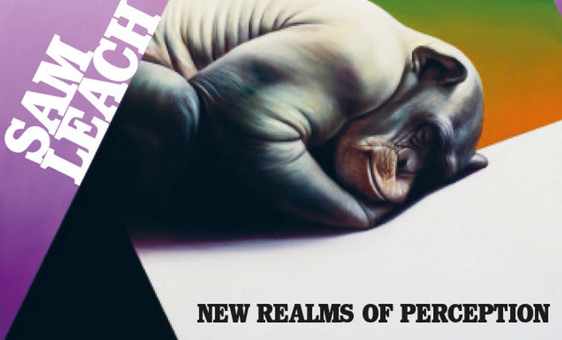
 Sam Leach’s paintings might be known for an oil-slick glossiness but his preference for sheen over substance is a visual trick. The Melbourne-based artist, who won the Archibald and Wynne prizes in 2010 and recently showed at Time Space Existence, a collateral event of the Venice Biennale, combines flat surfaces with landscapes that recall the 17th century Dutch Masters, rendered with the kind of startling acuity that reconfigures your understanding of the real and the imaginary along with your place in the world.
Leach’s full-colour new monograph, which features paintings such as Cinder with Partial Dymaxion (2013) and Evacuation of the Real (2011) and charts an ongoing fascination with nature, non-human animals and the history of science, is an arresting survey of his artistic terrain. He speaks to VAULT about his interest in corporate capitalism, his terror of sealing his ideas in print and how dead ends are only visible in retrospect.
Your paintings draw heavily on 17th century Dutch traditions and combine figurative and abstract elements that invite the viewer to question their relationship with the world. What have been the big shifts in your practice in the last few years?
I guess I started off being interested in the way that we relate to the built environment and phenomenon of the corporate foyer. This was around the 1990s and early 2000s when corporate capitalists were totally unstoppable. Around the same time, I came across a fascinating link between corporate foyers and the architecture paintings made in the Netherlands in the 17th century and the fact that this period corresponded with the rise of corporate capitalism really resonated with me because I could see aesthetic echoes everywhere. It made me ask ‘what is it about images that were produced during that era that have something to say about how we structure our society now?’ I then introduced references to non-human animals and how we relate to them. I then wanted to represent the history of science.
In terms of shifts that have been important to me, the incorporation of flatter abstract elements, which take visual cues from things like infographics and data visualisation has been significant. And another big step was experimenting with epoxy resin. Earlier on, I tried a whole range of finishes because I wanted to find a way to create some distance between the act of creating artwork and the viewer and lengthen that moment the viewer has before connecting with the artist. That’s now become a standard part of my practice. But the other elements are fluid.
In the last year, you’ve presented a body of work as part of Art 14 in London and the Melbourne Art Fair. And you’re also involved in Not Fair. In what ways do art fairs allow you to connect with your audience in ways that galleries don’t?
Art fairs are a really interesting phenomenon and since I’m pursuing art as my career, they’re kind of inescapable. And in some ways, if you take it seriously as a place to present your work and make a show with some integrity they can be a really interesting proposition. When you see work at a museum, it has this air sometimes of being sanctioned – the curators have made a selection and there’s a safety in that presentation of work that doesn’t exist at art fair. At the same time, they can feel like gigantic supermarkets and being one artist out of two thousand can feel very depressing.
Your new book features some of your most well-known works such as Cinder with Partial Dymaxion, Proposal for a Landscaped Cosmos and your Archibald-winning portrait of Tim Minchin. Can you tell me about how the project came about and what your motivations were for working on a print book?
I sort of resisted doing a print book for a while because I’ve always believed that my ideas are a work in progress and putting it in print kind of feels like this is the final point. But I guess it’s been approximately 10 years now that I started professional practice. It seems like a good time to survey what I’ve produced during that period and reflect on what themes have emerged, personally speaking. It’s also clearer which directions have been cul de sacs and which have been more fruitful.
What was the book’s curatorial and editorial focus and how did you go about choosing which paintings to include?
Initially, we talked about organising it as a chronological sequence but I also wanted it to reflect the broad themes that I address in my work from non-human animals and landscapes to science and technology. We loosely structured the book around those themes and then took in some design considerations. It was important to me that the book flowed in a coherent way. I also asked Tim Winton to write the opening essay. I met Tim through the Australian Marine Conservation Society where I’ve done some fundraising work with in the past. I’m a huge admirer of his writing and I approached him hoping that he would want to be involved. The essay that he produced blew me away.
How do you hope the book will resonate with your viewers in a way that other mediums don’t permit?
As my painting progresses, certain ideas are proposed or expressed in different times throughout my practice. Sometimes, there are references to ideas that I’ve addressed in different bodies of work and having a book like this is a useful way of giving a context to a painting in relation to another thing. So, if I put in a little motif, which might be a certain colour or shape in one painting and introduced it in another painting, the narrative threads become clear. The book offers a way for people to understand some of those relationships or appreciate where some of the elements of my work have originated and I hope that they enjoy that back story. And if others just appreciate the book in its own right, that’s fantastic.